
On the 15th July we launched the new eNudge Drag and Drop Email Campaign Editor, built from the ground up for our eNudge users.
This is a user guide to step you through the structure and main components and features of the email editor. There are also numerous individual articles describing individual features, which you can find under the ‘Email Editing‘ category of articles in our Help Centre.
User Guide
Below is a guide explaining how to use the new eNudge Drag & Drop Editor, to design email templates and campaign content.
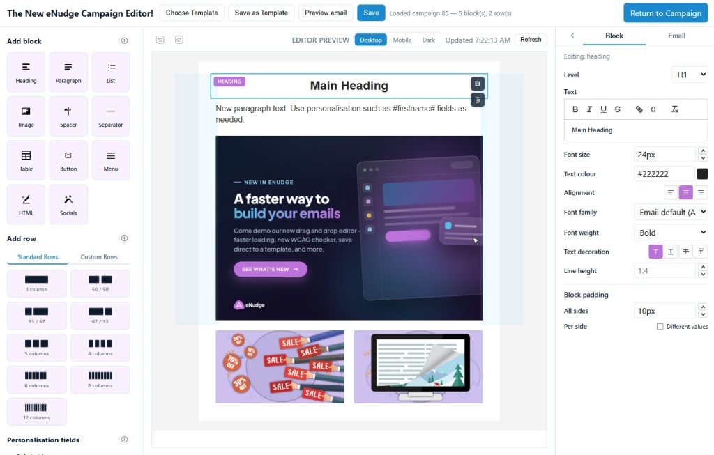
The editor has three main areas:
- Left panel — Add block / Add row: Drag content blocks and row layouts onto your email.
- Centre — Editor preview: A live preview of your email. Click items here to select and edit them.
- Right panel — Inspector: Settings for whatever is selected (a block, column, row, or the whole email).
At the top of the screen you will also find Save, Preview email, Choose Template, and a link to return to your campaign or template list.
1. Overall email structure
Every email is built in layers, from the outside in:
└── Email body (content area — usually white, fixed width e.g. 600px)
└── Rows (horizontal bands)
└── Columns (side-by-side areas within a row)
└── Blocks (heading, paragraph, image, button, etc.)
Email inspector (whole-email settings)
Click the Email tab in the right-hand inspector to edit global settings:
| Setting | What it does |
|---|---|
| Title | The email’s document title (used for accessibility metadata). |
| Language | The language of the email (also for accessibility). |
| Content width (px) | How wide the main email body is — typically 600px. |
| Default font family / size / colour | Applied to blocks that don’t set their own font. |
| Body background | The background colour of the main content area (the “white box”). Leave empty for transparent. |
| Body padding | Space around the inside edge of the body area. |
| Outer background | The colour behind the email body — often a light grey such as #f4f4f4. |
You can also set background images on the outer area and body, using the background image controls in the Email tab. Background images
work in many email clients, but support varies — use them as a visual enhancement rather than relying on them for essential content.
Rows
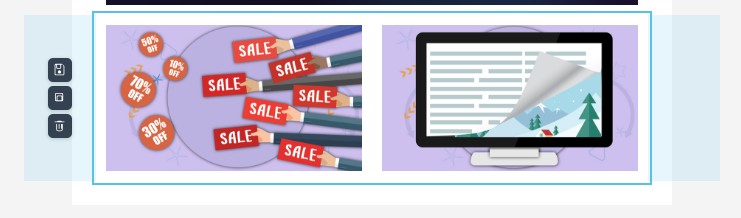
Rows are horizontal sections of your email. Use Add row on the left to insert layouts such as:
- 1 column (full width)
- 2 columns (50/50, 33/67, 67/33)
- 3, 4, 6, 8, or 12 equal columns
To add a row: drag a row preset from the left panel onto the preview, or click it to append a row at the bottom.
To edit a row: click the row in the preview (or its gutter area on the left). The inspector shows:
- Vertical alignment — how content sits vertically within columns (top / middle / bottom)
- Row background — colour and optional background image
- Row padding — space inside the row, around its columns
- Rounded corners — where email clients support it, rounding the corners can allow you to have a rounded edge
- Row border — choose a style (dashed, dotted or solid), colour and which of the 4 edges should have the border applied
Each row also has action buttons in the preview gutter: Duplicate, Save row (saves to Custom Rows for reuse),
and Delete.
Columns
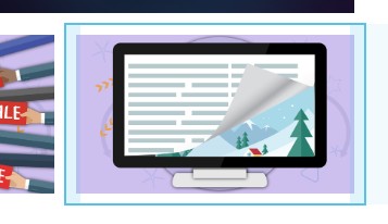
Each row contains one or more columns. Click a column in the preview to edit it:
- Column width — e.g. 50%, 33%. Other columns in the same row adjust automatically to total 100%. View our video instructions on changing the width of columns in a multi-column row.
- Text colour — overrides the default for content in that column
- Column padding
- Vertical alignment
- Column background — colour and optional background image
- Column border — where email clients support it, rounding the corners can allow you to have a rounded edge
After selecting a column, you can easily duplicate it, which adds another copy of the column immediately to the right. Or you can delete it. If you want all your columns evenly spaced, or have drag and drop control of the width of each column, you can do that while editing the row that the columns sit within.
Block padding
When a block (paragraph, image, button, etc.) is selected, the inspector includes Block padding controls at the bottom.
This adds space around that individual block, inside its column.
2. Adding text
Headings and paragraphs
- From Add block on the left, drag Heading or Paragraph onto the preview (or click to add at the end).
- Click the block to select it so that you can drag it somewhere else, or click to copy or delete.
- Double click to go into edit mode, so that you can change the text.
- Use the icons at the top of the text panel to make more detailed adjustments to selected text:
- Bold, italics, underline and/or strikethrough
- Change the font size
- Superscript or subscript
- Hyperlink the text to a web page, email address (optionally with a subject & email content), or telephone number. We recommend you choose to open hyperlinks in a new tab.
- Change the font colour.
- Add a highlight behind the text.
- Clear the formatting.
- The toolbar options also allow you to insert special symbols such as copyright and trademark symbols.
In the right hand inspector panel, you can change the overall settings for your text, including:
Heading blocks let you set heading level (H1–H4), font size, weight, colour, alignment, text decoration and line-height.
Paragraph blocks allow you to set the font size, font family, text colour, link colour, and whether links are underlined. You can also specify the line-height.
Personalisation fields
Available Personalisation fields (e.g. #first_name#) appear under Personalisation fields in the bottom of the left-hand panel. Drag a field into the
paragraph rich text editor, heading or list to insert it. Alternatively, place your cursor in the text editor where you want the personalisation field to be inserted, and click on the name of the personalisation field. These placeholders are replaced with real data when the email is sent.
3. Adding a hyperlink to selected text
Hyperlinks can be added to text inside Paragraph, Heading or List blocks:
- Start editing your text, and highlight the words you want to link.
- Click the link icon in the popup toolbar.
- In the link dialog:
- Choose the type of hyperlink (defaults to website – read more about hyperlinks).
- Enter the full URL e.g. https://www.example.com
- Choose Open in — New tab or Same tab
- Click Apply
To edit an existing link: click the linked text while is text edit mode. The same dialog opens with the current details, so you can update the details, or click Remove link.
You can also set Link colour and Link underline (None / Underline) for the whole block in the inspector — these
apply to all links in that block.
4. Adding an image
- Drag the Image block onto the Editor Preview.
- You can then either:
- drag an image from your computer’s file explorer onto the image block, or
- choose the image block, and click Manage in the inspector to open the Image library and choose from an image you have already uploaded, or upload and insert.
Uploading bulk images
In the Image library:
- Click Upload images and choose one or more files (JPEG, PNG, GIF, or WebP — max 1 MB each).
- Browse folders using the breadcrumb at the top.
- Click an image to use it in the block.
You can also create folders to organise your images. Click into the folder name field, type in the folder name, and click ‘Create Folder’ button. You can then navigate to your new folder and upload images into the folder for easy future access to insert into your email campaigns.
Using a free stock image (Pixabay)
The Image library has a Pixabay stock tab:
- Choose Photos or Illustrations.
- Search for a topic.
- Click a result to import it into your library and apply it to the image block.
Imported stock images are stored in your image library for reuse.
Image block settings
After choosing an image, set:
- Alt text — describe the image for screen readers and when images are blocked (important for accessibility)
- Link URL — optional: makes the image clickable
- Width — percentage of the column width, or set exact pixel width.
- Height — height of your image in pixels. If you adjust the height, the width will adjust to keep the same width to height ratio.
- Alignment — left, centre, or right
- Border radius — adding a border radius will apply rounded corners to your image, for email clients that support this style
You can also add padding around your image, either the same padding for all sides, or different padding for particular sides.
5. Adding a separator
A Separator draws a horizontal line across the column.
- Drag Separator from Add block onto the preview.
- Select it and adjust in the inspector:
- Line colour
- Line style — solid, dashed, or dotted
- Line weight — thickness in pixels
- Line width — percentage of the column (e.g. 100% for full width)
- Alignment — if the line is narrower than the column
Use a separator when you want a visible dividing line between sections of content.
6. Adding a spacer
A Spacer adds empty vertical space — there is no visible line.
- Drag Spacer from Add block onto the preview.
- Set Height (px) — e.g. 24px, 48px, 80px in the inspector.
You can optionally give a spacer a background colour or background image, which is useful for creating coloured
bands of empty space.
| Separator | Spacer | |
|---|---|---|
| Visible? | Yes — a line | No — blank space |
| Purpose | Divide content visually | Add breathing room between blocks |
| Main control | Line colour, style, weight | Height |
7. Adding a menu
The Menu block creates a row of text links — useful for navigation headers or footers.
- Drag Menu onto the preview.
- In the inspector, manage Menu items — each item has a Label, URL, and Open link in setting.
- Use Add item, reorder arrows, or Remove to manage items.
Styling options include font size, colour, alignment, font weight, Link underline, separator between items (pipe |, bullet •, or none),
spacing between items, and mobile menu icon colour.
On mobile, multi-column rows can stack; the menu adapts for smaller screens. In some email clients (especially Outlook on Android), the menu displays as
stacked links rather than a hamburger toggle, for reliable rendering.
8. Adding social links
The Socials block displays social network icons linked to your profiles.
- Drag Socials onto the preview.
- Choose an Icon style — brand colours, dark, light, or grey.
- Add or edit items: pick the network (Facebook, Instagram, LinkedIn, etc.) and enter the URL.
- Adjust Icon size, Icon spacing, and Alignment.
Use real profile URLs so recipients can find your social pages.
9. Adding a table
The Table block is for structured data such as pricing, schedules, or feature comparisons.
NB: Tables should be used sparingly as they can be difficult to style and render consistently across email clients, and create additional challenges when
viewed on mobile devices. Instead, we recommend using columns and rows to create a table-like layout, whenever possible.
- Drag Table onto the preview.
- Double-click into the heading cell or row cell to start editing the text.
Additional settings, accessed via the right hand inspector:
- + Row, − Row, + Col, − Col to add or remove columns and rows from your table. These are always added or removed from the end of the row (for columns) or table (for rows).
- Header rows — you can specify that the 1st row is a header row, or that there is no header row
- Header background & text colour
- Striped rows — alternating row background colours, allowing you to set the background colour for the alternate
- Border colour & border width
- Cell padding
- Font size & font family – applies to all text in the table, unless you specifically edit selected text using the popup toolbar options
- Text alignment – the selected alignment applies to all cells in the table
- Link colour – applies to all hyperlinks added to any text in the table. To add a hyperlink within the table, select text in a cell, and then use the ‘Link’ button in the popup toolbar.
- Link underline – choose underlined or not; applies to all hyperlinks within the table.
- Block padding – set the padding around the table block as a whole. You can set top, right, left and bottom independently if required.
10. Adding HTML
The HTML block lets you paste custom HTML when the standard blocks aren’t enough. eNudge will sanitise HTML on save and render — only
email-safe markup is kept.
Allowed: tables, text, lists, links, images
Not Allowed: scripts, forms, iframes, and unsafe URLs
Use HTML blocks sparingly — they require more care for mobile and email client compatibility.
11. Mobile responsiveness
Many recipients read email on phones. The editor includes a Mobile preview mode and mobile-specific settings.
Mobile preview
Above the centre preview, click Mobile (alongside Desktop and Dark). The preview narrows to simulate a phone screen. While in Mobile
mode, the inspector shows mobile-specific controls for the selected row or block.
Switch back to Desktop to edit desktop settings.
Row mobile settings
Select a multi-column row while in Mobile preview:
- Stack columns — columns appear one above the other on mobile (recommended for most layouts).
- Reverse column order when stacked — flips the stacking order. This is useful for intermingled text + image layouts, where the image
alternates from left to right. - Visibility — hide the row on mobile or desktop.
Block mobile settings
Select a block while in Mobile preview:
- Mobile font size — different text size on mobile (headings, paragraphs, lists, buttons, menus)
- Mobile block padding — different spacing on mobile
- Visibility — hide specific blocks on mobile or desktop (available for images, menus, socials, spacers, separators, HTML, and tables)
Tip: Design on Desktop first, then switch to Mobile and adjust anything that looks too small, too cramped, or unnecessary on a small screen. often
it is good to increase the font size on mobile, and add padding to the blocks, to make them more readable.
12. Dark mode preview
Click Dark above the centre preview to simulate how your email may appear when a recipient’s device or email app uses dark mode.
Dark mode preview adjusts colours in the preview so you can check whether text remains readable and images still look acceptable. NB: it is a preview aid only — not
every email client handles dark mode the same way, so treat it as guidance rather than an exact guarantee.
Use light text on dark backgrounds carefully, and avoid relying on very low-contrast colour combinations.
13. WCAG accessibility check
The editor includes an automated Accessibility Check aligned with common WCAG 2.2 Level AA requirements.
- Click the Email tab in the right-hand inspector.
- Click Accessibility Check at the bottom of the panel.
The check reviews your current design and reports issues such as:
- Missing or weak alt text on images
- Colour contrast problems between text and backgrounds
- Generic link text (“click here”, “read more”)
- Missing email title or language
- Heading structure concerns
- Custom HTML issues
Each finding shows the relevant WCAG criterion. Click a result where offered to jump to the affected block.
Important: This is automated guidance, not a full audit. Always review your email in real clients before sending, especially if accessibility is critical for your audience.
Quick reference — common tasks
| Task | How |
|---|---|
| Save your work | Click Save (top toolbar) |
| Preview final HTML | Click Preview email |
| Undo / Redo | Buttons above the preview, or Ctrl+Z / Ctrl+Y |
| Reorder blocks | Drag blocks within the preview |
| Reorder rows | Drag rows using the row gutter handles |
| Start from a template | Click Choose Template |
| Save a row for reuse | Select a row → click the save icon in the row gutter → name it → find it under Custom Rows on the left |
| Return without saving | Click Back to Campaign / Back to Templates — you will be prompted if there are unsaved changes |
Tips for new users
- Click to select — double-click on text to edit, change overall settings in the right-hand panel.
- Save regularly — preview and accessibility checks use your current design but do not save it.
- Use alt text on every meaningful image.
- Test on mobile — switch to Mobile preview before finishing.
- Keep it simple — standard blocks (paragraph, image, button) render more reliably across email clients than complex HTML.
- Outer vs body background — outer background is the area around the outside of the body of the email; body background is the main
content panel. Set both deliberately for a polished look.