
Customising how your email appears on mobile devices is very easy with the eNudge drag and drop editor.
Editing Elements
Firstly, while editing your campaign, use the desktop / mobile icons in the top navigation to choose how you are previewing:

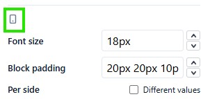
While in mobile view, you will see that for some elements you can specify different measurements for mobile, indicated by the mobile phone icon.
You can specify different padding values for mobile, and font sizes, depending on the element you are editing.
Editing Rows
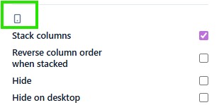
Selecting a row with multiple columns gives you access to the following additional layout settings for mobile:
- Stack columns – meaning that, when switched on, your columns will be one on top of each other, rather than attempting to fit side by side.
- Reverse column order when stacked – meaning that the 2nd column will be shown before the 1st column. This is handy when you have a series of rows of images beside a text column, where the order is alternated. That causes an unnatural layout when stacked, and so it’s good to reverse the stacking on the in-between rows.
Hiding Elements
By default, every row will be shown on both desktop and mobile. However, in certain situations where your content is hard to render usefully on both mobile and desktop, you might choose to have one version of a row that is shown on desktop, and another version that is shown on mobile. For example, a complex graph might work on the desktop view, but be replaced by a summary image on mobile.
In such a case, hide one version of the row for mobile, and hide the other version of the row for desktop, but clicking on the appropriate desktop or mobile icon.